Exclusive Pix from the Developer Grid: SL’s New Zone Concepts Interface
by Alphaville Herald on 17/08/07 at 11:25 pm
The next version of SL?
by Pixeleen Mistral, food critic
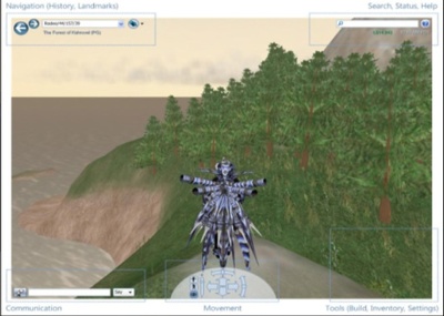
Zone Concepts Interface: brighten the corners
I considered having another glass of wine while waiting for the wild coho salmon filet slathered in finely chopped fresh organic parsley to finish steaming over a what I hoped would become a Grey Goose vodka and sicilian blood orange reduction — if my calculations were correct. However, the calculus of culinary choice suddenly narrowed. The iMojo wire was demanding attention with breaking news from the betaverse – an exclusive photo of the new look and feel for Second Life. Maybe.
Readers are cautioned that the iMojo is not always completely reliable, but our source provided what appears to be a screen shot of the next version of SL – or at least a mock up – reproduced here so that long suffering citizens can begin preparing for another forced march into the future, as envisioned by the game gods of our “better world” – the physics experts at Linden Lab. If our source is to be believed, this is a picture from the developer grid.
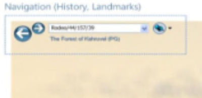
top left: Navigation (History, Landmarks)
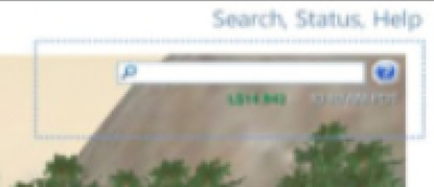
top right: Search, Status, Help
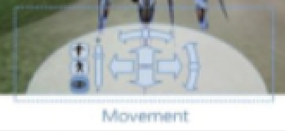
Somehow we are not surprised that the “friends” button has gone missing – perhaps this is part of the “serious business” direction the Lab is taking? If the leaked screen shot is real, a much better world is to be found in the corners of the screen, with the bottom center reserved for navigation.
As we passed the grainy photo around the Herald offices in Hyperborea, the office cat suggested that perhaps moving the mouse into the corners of the screen would activate the menus. The cat could be right, but she was persuaded to refocus her attention on more immediate concerns once the salmon was artfully plated in her catfood bowl. She didn’t seem to care much when we told her that Mono scripting is likely to be part of the new version of SL, or that an open source server might be available near the end of the calendar year.
The cat has been ignoring Mono scripting rumors for the last year, preferring to clean herself and cough up furballs rather than get her hopes up. As Jimbo Quality learned the hard way during an unfortunate cat griefing incident, you can only fool the office cat so many times.



Tiffany Wilder
Aug 18th, 2007
Grey Goose Rocks !!! – sorry stopped reading after that
On a serious note I am sure LL would Never add a different interface with bells an whistles without fixing all the bugs first, ….would they ??
Oh wait forgot who we were talking about, never mind, carry on.
Somatika
Aug 18th, 2007
Yeah that is legit!
http://wiki.secondlife.com/wiki/User_Interface_Improvements
Herald should do some research! “No one seams to even think about using the SL wiki for some odd reason!”
This has been a comment by the Cyan Man not from Japan Somatika Xiao!
X
Aug 18th, 2007
Fake. My guess is it’s an open sourced client.
Nicholaz Beresford
Aug 18th, 2007
Yes, it’s legit and yes, it’s not. Neither is it exclusive nor is any of this fixed. It’s merely a mockup to start the discussion and the UI wiki page clearly says so.
brugis
Aug 18th, 2007
The Exclusive Pics – Rocks !!!
Maximilian Goldflake
Aug 18th, 2007
First of all, Grey Goose is overrated and overpriced. Secondly, I really like the look of this type of interface. However, the navigational controls on the bottom seem superfluous. Now, if it comes with less lag, then I’m sold on it.
Gwyneth Llewelyn
Aug 18th, 2007
In any case, the mere thought that LL is developing a second-generation client (SL 2.0?) is very, very good news. Yes, I was aware that periodically Lindens gather in their office hours residents interested in discussing the new UI for SL. The discussion page on the UI wiki page is interesting to follow — lots and lots of good ideas there!
Most important than everything is the commitment to a long-term development by Linden Lab. Oh yes, these guys are here to stay, no matter what Time, Wired, or the current trend of the naysayers is reporting these days!
Malburns Writer
Aug 18th, 2007
Whoopie!
Sounds like closer to what I want – here’s hoping.
Tenshi Vielle
Aug 18th, 2007
Oh god. Keep your fingers crossed.
chopperdave
Aug 19th, 2007
Furries; What are they really? Most people see them as a threat, however.. Oh hell with it, yes, they are a threat. Not only are they a threat to SL, but they are a threat to real life as well!
What will we do? Who shall we turn to? Maybe a group of patriots.. a group of people pressed through true oppression.. Not this “fursecution” that furries go rampant on, but real persecution. These people.. They shall not be denied!
Furries will rue the day they opted to mess with the world..
Luca V
Aug 20th, 2007
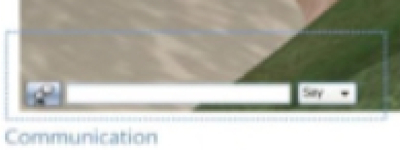
In the close up of the communications bar there’s a blue button to the left that may or may not open up a drop do… up. From there there’s probably things like history, friends, groups, IMs.