Patrice Cournoyer — The 12 Days of Post 6-mux Grrrrls
by Alphaville Herald on 21/12/09 at 6:19 am
[Patrice Cournoyer is one of the most interesting of the past Post 6 Grrrls I've had the opportunity to meet. She is smart and talented and thoroughly original. She was originally featured by Post 6 founder Marilyn Murphy in January 2007. It was a pleasure to meet her, and a bigger honor to feature her again. ~Timothy Morpork]
It is hard for me to believe that I did my last Post 6 session almost exactly 3 years ago (although it was published in January of 2007). Lots has changed in my SL. Some sad, some great.
I am not married (although I do have some wonderful girlfriends). I am definitely bi-sexual now, which, as Woody Allen says, does double your chances of getting a date.
As far as work in Second Life goes, I still terraform, but I have been working more on some SLDev initiatives in the last few months.
For fun, I hang out at the Wastelands , where I write for the Salvaged Times, run the Museum and work on the Public Works committee. I recently started attending Hillcrest College in Hessen, where I am pledging to Kappa Alpha Tau and Sigma Alpha Alpha.
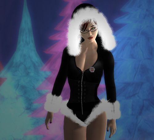
What else has changed? My bod is all my own work now, hair changes often *grin*, but my skin is still the same from my sis, Govindira Galatea. The hot little black Santa outfit is Cutie Cobbler by Eloria LeShelle (Battered Boudoir)
Great to be back on Post 6, thanks Timothy and Pixeleen.


marilyn murphy
Dec 21st, 2009
good to see you again pat. lovely as ever.
Mary Elizabeth
Dec 21st, 2009
Interesting lady, lots going on. That’s nice to see. Little sis needs to update the skin, though.
Faye Serendipity
Dec 21st, 2009
Timothy, why don’t you use Windlight ever in your photography? Is it so we can have a more SL-istic grrrl? Or because then the grrls might look half decent (Or even less) and that would ruin the lulz? This one was lacking in lulz though, rather yawn.
James Freud
Dec 21st, 2009
There’s some crazy stretch marks right above her tits. Why would you add stretch marks to your avie? She looks like a 55 year old librarian posing naked for the library Christmas calendar. Creepy.
Marianne
Dec 22nd, 2009
/me bangs her head in the keyboard. Timothy, I know you hate criticism and probably never will listen, but can’t you try to use sky settings that’s a bit more flattering? I have never seen you go out and defend your photos and claim that you use “raw” SL photos on a purpose. That is another side of it of course, if you will show SL like 95% of the users see it. Let’s face it, most never use any settings at all, other than the default ones.
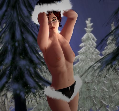
Very nice bio Patrice. White fur is the thing all use as trimming now, but it don’t photograph well. Your shape is designed to look more realistic, but the second picture isn’t very sexy. The white fur look awful, your torso has all kind of weird shading and your breasts look….saggy in that pose. Lifted arms should make your boobs a bit more perky. The avatar mesh that crate a “gap” in the chest under the collarbone is very visible here. Better skin makers can almost make it disappear. So even if you love the skin, it don’t win me over. Sorry.
Marianne
Dec 22nd, 2009
Edit: *The avatar mesh that create a “gap”*
butwait
Dec 22nd, 2009
I don’t know if this matters, but to my untrained eye, based on the sky in the backgrounds the previous four or five models all appear to be in non-standard SL lighting, aka the “Windlight” Faye and Marianne ask for, so I don’t know what the heck you all are talking about. Look at the sky in the first picture of Florence Raghilda. That’s definitely not the standard sky. I saw Patrice’s pics and assumed it was a throwback series because Patrice is old school.
I like these a lot, it’s nice that Timothy’s pictures are so varied. You look great Patrice!
Faye Serendipity
Dec 22nd, 2009
@butwait: If windlight is on, it’s not very well set. I think non-standard lighting is mostly the 2 minutes in Photoshop though.
Marianne
Dec 24th, 2009
It is the way the light fall over the model that bothers me. Yes he can use some windlight but he fail to see what works with the models skin, her clothes and the background. Most of the light is creating harsh shadows. Remember that poor Gorean girl, his ugliest photos up to date, she was shot in orange/red light, my guess is standard sunrise. That made her skin look carrot-orange. This model should have a bit more red in the light, since her skin is so pale and low in details. She would benefit from a bit glow. Also the sun should be moved and reduced as much as possible, to make the shading soft so the avatar mesh is treated as flattering as possible.
Prof. Archie Lukas
Jan 2nd, 2010
At least you have a decent photograph this time
Errin
Jan 8th, 2010
At least you could have made an effort to ditch that freebie skin of yous and find a good skin for this photoshoot…or rather picked a decent one you get these days from good desingers giving for free..but yeah whatever good luck if finding the answers wondering if you fcuked up the photoshoot..